Design, ergonomics students to present infographics study
By Christa Nianiatus
In a culture awash in data, infographics -- visual representations of facts and figures -- are vital to communicating complicated information on websites, in books and newspapers and elsewhere.
Using eye-tracking technology, Cornell students and professors in interior design and ergonomics have joined together to uncover new details about how people absorb infographics and to develop recommendations for how to improve them. The findings, to be presented at the Fourth International Applied Human Factors and Ergonomics Conference, July 21-25, in San Francisco, will be published as a chapter in the conference book.
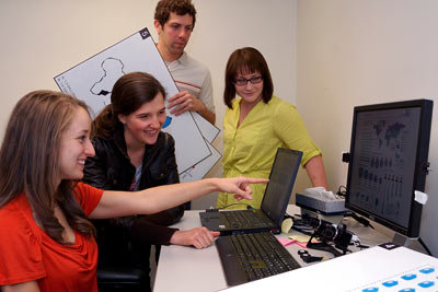
The project, led by lecturer Leah Scolere and professor Alan Hedge, both in the Department of Design and Environmental Analysis (DEA) in the College of Human Ecology, included DEA seniors Jordan Licero, Brie Reid, Carolina Acevedo Pardo and Gilad Meron.
Reid, Pardo and Meron, while taking Scolere's Visual Thinking and Story Telling course, classified infographic designs into five categories: flow chart, poster, annotated graphic, icon grid and chosen path design, which presents readers with multiple options. They wanted to objectively measure how people take in these different designs.
"We did some background research and found that there was almost nothing done in this specific field of how people read infographics," said Meron.
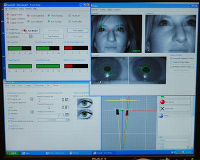
So, according to Reid, the students "decided to put infographics to the test." Licero, working with Hedge, commissioned an eye-tracking system -- a pair of high-resolution, infrared cameras mounted beneath a computer screen. The system recorded where research subjects' eyes moved as they viewed various infographics on the screen. Through heat maps and other data outputs, they could measure what elements were most attention-grabbing to viewers -- what captured their gaze first and held it longest.
To their surprise, the researchers discovered that blending images and text seamlessly, rather than trying to call attention to each element separately, was most effective. It disproved their rare elements theory that suggested that viewers would gravitate toward the most unusual stand-alone features of an infographic.
"It's not about just putting text and images together, but synthesizing the two to create this new narrative language," Meron said.
The study also revealed stark gender differences in which designs subjects preferred. Women focused more on images, whereas men looked first and longer at text.
"We tend to think everyone is the same when we're designing [infographics], but clearly they're not," Hedge said.
Hedge added that the experience was valuable for students not only to see what it takes to go from a class project to findings worthy of a major international conference but also to write and revise for an academic conference. The group hopes to refine the work and eventually produce a peer-reviewed paper on infographics.
"The whole project took a lot more than I anticipated to go from an idea to a full study. ... I think we did something like nine edits to the finished paper before submitting it just before deadline," Licero said.
"I don't think any of us knew what to expect when we were getting into this," Pardo said, "but we found out it would take a lot of work, and we learned as we went along."
The research was funded in part by the College of Human Ecology, which paid a summer stipend to Licero to help commission the eye-tracking device.
Christa Nianiatus '13 is a student communications assistant for the College of Human Ecology.
Media Contact
Get Cornell news delivered right to your inbox.
Subscribe